


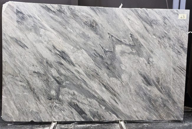
Quick SummaryChoose Patagonia Quartzite when the design needs bold, graphic stone movement with dramatic contrast and a composition that can become the visual centerpiece of the room. Choose Cristallo Quartzite when the design calls for a lighter, more crystalline statement, especially where translucency and controlled backlighting are part of the concept. Neither is automatically better: the decision depends on the actual slabs, the desired visual intensity, lighting strategy, panel layout, fabrication geometry and the level of project control available before cutting.
Patagonia Quartzite vs Cristallo Quartzite: The Direct Verdict
For a bold, graphic statement interior, Patagonia Quartzite is usually the more expressive design direction; for a luminous, crystalline statement with carefully engineered backlighting, Cristallo Quartzite is usually the more natural starting point.
The difference is not simply “busy stone versus white stone.” Patagonia Quartzite can combine translucent crystalline fields, cream and pale neutral areas, smoky transitions and controlled dark mineral fragments in an irregular block-like composition. Cristallo Quartzite generally creates a lighter impression through icy white to pale grey crystalline structure, cloud-like fields and varying degrees of translucency.
Both can become feature materials, but they create different architectural experiences. More importantly, both should be selected from actual slabs. A commercial stone name does not guarantee that every slab will have the same transparency, contrast, pattern distribution or usable fabrication zones.
Choose by Design Intent
Choose Patagonia Quartzite when the stone itself should behave like a large natural artwork. Choose Cristallo Quartzite when crystalline depth, lightness and possible interaction with backlighting are more important than strong graphic contrast. In both cases, approve the actual slabs and proposed panel layout before fabrication.
Side-by-Side Decision Matrix
| Factor | Patagonia Quartzite | Cristallo Quartzite | Best Choice When |
| Visual Character | Bold, irregular, high visual variation with contrasting crystalline and darker areas | Lighter, crystalline, cloud-like and generally more ethereal | Patagonia for graphic drama; Cristallo for luminous restraint |
| Statement Effect | Stone becomes a dominant artwork-like feature | Stone creates depth through crystal structure and light | Depends on whether contrast or luminosity leads the design |
| Backlighting | Possible only where the selected slab contains suitably translucent areas | Often a stronger candidate where the actual slab demonstrates useful translucency | Cristallo when controlled transmitted light is central to the concept |
| Layout Sensitivity | Very high because major visual fields and dark fragments strongly affect finished composition | High where crystal fields, seams and lighting need visual continuity | Both require actual-slab planning for major feature work |
| Fabrication Planning | Cutting positions should respond to changing geological zones and finished-piece geometry | Requires careful planning where translucent zones, seams and lighting assemblies interact | Choose only after fabricator reviews the actual slab and design geometry |
| Best Design Role | Hero wall, island, bar front or highly visible custom feature | Luminous wall, reception feature, bar, vanity or refined focal surface | Match the stone to the intended visual hierarchy |
Visual Difference: Graphic Composition vs Crystalline Depth
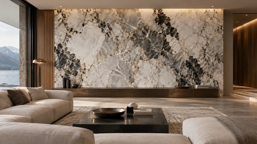
Patagonia Quartzite has a visual identity built around contrast and irregularity. A representative slab may contain milky or translucent crystalline blocks, cream-white and pale beige transitions, smoky grey areas and darker fragments. These zones can shift dramatically across the slab, which means the finished design is strongly influenced by where each component is cut.
Cristallo Quartzite creates a different kind of complexity. Its lighter white-to-icy-grey crystalline fields can appear quieter from a distance, while closer inspection reveals crystal lines, cloudy mineral structures and changing levels of transparency. Under suitable lighting, depth can become more important than color contrast.
This distinction affects the room around the stone. Patagonia can dominate an otherwise restrained palette. Cristallo can remain visually light while still becoming a focal point through texture, crystal structure and illumination.
For architects and designers, the practical question is therefore not which stone looks more luxurious. It is how much visual authority the feature surface should have within the complete interior.
Which Stone Works Better for a Feature Wall?
For an unlit statement wall where the stone should provide strong natural graphics on its own, Patagonia Quartzite can be especially effective. Large panels allow the contrast between crystalline areas, warm neutral fields and darker fragments to read as one composition.
Cristallo Quartzite is compelling when the feature wall is intended to feel lighter or when illumination is integrated into the architectural concept. However, a designer should not assume that every Cristallo slab will transmit light uniformly. Actual slab testing is essential before the lighting assembly is finalized.
Panel dimensions, joints and architectural interruptions also matter. A beautiful slab can lose much of its impact if critical visual fields are divided by poorly positioned seams, screens, shelving, signage or other interfaces.
Design ScenarioPatagonia direction: use when a large reception backdrop, residential feature wall or hospitality bar needs strong geological movement even without transmitted light.
Cristallo direction: use when a reception wall, bar, vanity feature or architectural panel should feel crystalline and luminous, especially when a controlled lighting system is part of the design.
Backlighting Changes the Cristallo vs Patagonia Decision
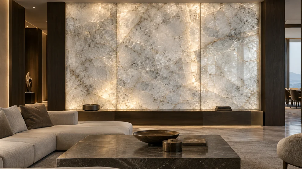
Backlighting should be treated as an engineered design condition, not as a photographic effect added after stone selection.
Cristallo Quartzite is frequently associated with translucent visual effects because crystalline portions of suitable slabs can transmit light. Yet translucency varies across natural material. The designer should inspect the actual slab under representative transmitted-light conditions before committing to the final panel composition.
Patagonia Quartzite can also contain translucent crystalline areas, but these may sit beside opaque cream, grey or dark mineral zones. Backlighting can therefore create a more irregular light-and-shadow composition. That may be desirable when the design intentionally uses geological contrast, but it should not be mistaken for uniform illumination.
For either stone, the lighting design must consider the selected material, panel thickness established by the project, support system, cavity, light-source distribution, heat management, access for maintenance and the visibility of structural or adhesive elements. Those details should be resolved with the relevant stone fabricator, lighting specialist and project team rather than inferred from a showroom sample.
Actual Slab Selection Matters More Than the Commercial Name
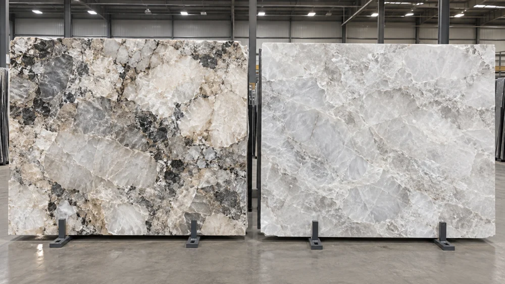
Two slabs sold under the same stone name can create noticeably different finished interiors. That is particularly important with visually expressive Quartzites.
When reviewing Patagonia Quartzite, examine the complete distribution of translucent blocks, warm neutral zones, smoky transitions and dark fragments. Decide which areas should become the visual center and which should be kept away from critical seams, cutouts or narrow fabricated components.
When reviewing Cristallo Quartzite, look at crystal density, cloud-like areas, linear structures, transparency and any zones that change appearance under light. If the project will be backlit, evaluate the slab in transmitted light rather than relying only on front-lit warehouse photography.
For either material, a full-slab photograph is useful for early planning, but visually important projects benefit from connecting the actual slab to the proposed cutting geometry before fabrication.
Fabrication: The Same Drawing Can Behave Differently on Each Slab
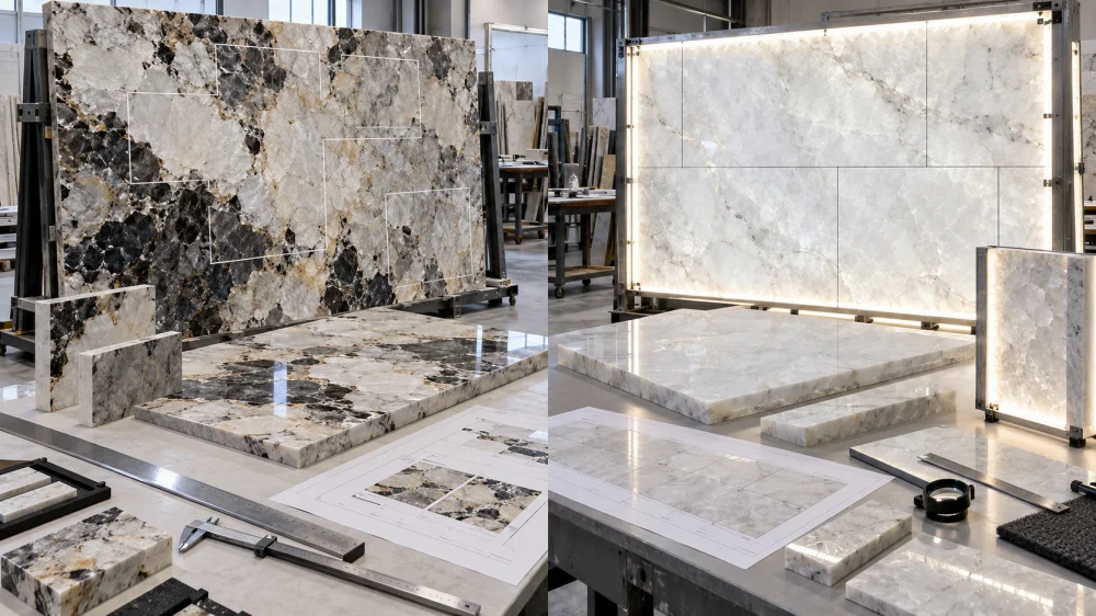
The architectural drawing defines the required component geometry, but the slab determines how that geometry intersects with natural features.
With Patagonia Quartzite, an island end, wall panel or narrow return can move from a pale crystalline zone into a darker fragment within a short distance. Cutting layout therefore has a major influence on visual balance. The strongest visual area is not automatically the best place for every cutout or narrow component.
With Cristallo Quartzite, fabrication planning becomes especially sensitive when translucency is part of the design. A seam, reinforcement, adhesive zone or support element that is visually discreet under ordinary front lighting may become more apparent when light is transmitted through the stone.
In both cases, the fabrication team should review natural features and component geometry before critical cuts are released. Visual selection and engineering review should remain separate approval questions.
Technical Risk
Do not approve a statement-stone layout only because the CAD arrangement looks attractive. The final release should consider the actual slab, natural features, seams, cutouts, narrow sections, edge conditions, support and, for backlit work, what may become visible through translucent areas.
What About Bookmatching and Panel Sequencing?
Both stones can benefit from deliberate panel sequencing, but the desired result is different.
With Patagonia, adjacent panels may be arranged to control large geological blocks and contrasting areas. Depending on the actual slab sequence and project design, the objective may be visual continuity, a mirrored composition or simply a balanced distribution of strong features.
With Cristallo, sequencing can help coordinate crystalline movement and light transmission across a larger wall. If multiple panels are backlit, differences in translucency between panels can become part of the visible composition and should be reviewed before installation.
Bookmatching should never be promised from a stone name alone. It depends on the available slab sequence, how the block was processed and whether the resulting paired surfaces create a composition appropriate for the project.
Maintenance and Real-World Use
Neither Patagonia Quartzite nor Cristallo Quartzite should be specified as maintenance-free simply because both are commercially categorized as Quartzite.
For interior feature walls, maintenance exposure is often lower than on kitchen worktops, but surface finish, cleaning access and surrounding conditions still matter. Bars, vanity surfaces and islands introduce more direct contact with liquids, oils, cosmetics or food-related substances.
Where sealing is considered, the proposed treatment should be compatible with the actual stone and finish. For backlit material, any treatment that may affect color or light transmission deserves representative testing before broad application.
Routine cleaning should follow appropriate natural-stone care practices and the requirements of the installed finish rather than aggressive general-purpose chemicals.
Which One Costs More?
Without a verified project quotation, it is not responsible to declare that Patagonia or Cristallo will always cost more.
The stone itself is only one cost driver. A statement interior can also be affected by slab yield, number of slabs required to achieve the approved composition, cutting layout, panel size, edge work, reinforcement or support requirements, dry-lay review, packing and installation complexity.
Backlighting can change the comparison further. A backlit Cristallo installation may require a lighting cavity, light distribution system, supporting structure, electrical coordination, mock-up and access strategy that do not belong to the raw slab price.
Patagonia may create its own yield challenge when the design requires specific high-impact geological areas to fall in specific finished components. Buyers should therefore compare approved project scope, not simply price per slab.
How Should Buyers Approve Patagonia and Cristallo Quartzite?
For statement interiors, procurement should preserve the connection between design approval and the actual material being fabricated.
- Review complete slabs: do not select either stone from a small sample alone.
- Identify the intended focal area: feature wall, island, reception backdrop, bar or another statement element.
- Confirm the finish: review how the specified finish changes reflection, crystal depth and overall tone.
- Test translucency where relevant: especially when backlighting is part of the Cristallo or Patagonia concept.
- Overlay the cutting layout: connect actual geological zones to finished components.
- Review seams and panel sequence: particularly for large walls and multi-panel compositions.
- Separate visual and technical approval: an attractive layout still needs fabrication and support review.
- Inspect before packing: verify agreed orientation, finish, panel relationship and visible fabrication details.
Which One Should You Choose?
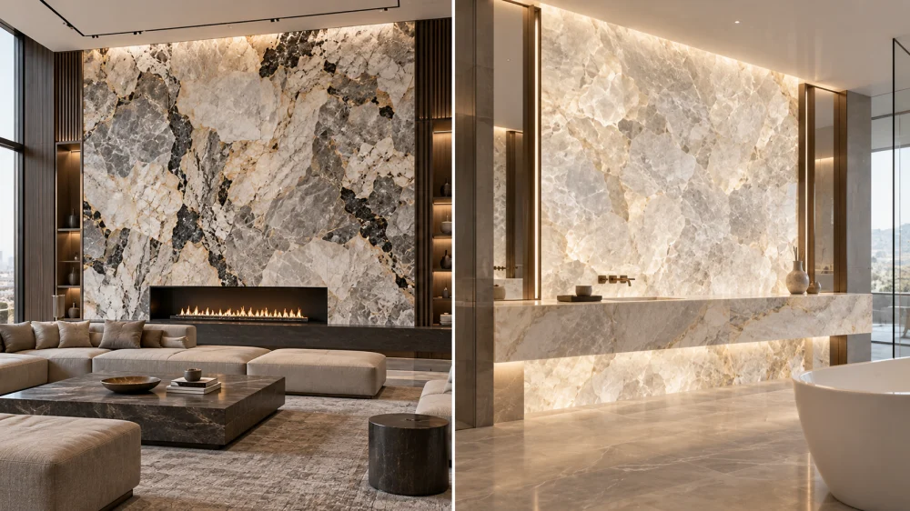
Choose Patagonia Quartzite when visual contrast and geological drama are the primary design objective. It is especially suited to interiors where the stone should read as a dominant natural composition rather than a quiet background surface.
Choose Cristallo Quartzite when the design priority is crystalline lightness, depth and the possibility of controlled transmitted light. It can create a statement without relying on the same level of dark-versus-light contrast.
If the project is backlit, do not make the decision from material names or online images. Compare actual candidate slabs under representative lighting conditions. If the project is not backlit, compare the complete slabs at the scale they will actually be seen and evaluate how the proposed cutting layout converts each slab into the finished architecture.
Practical Takeaway
Patagonia Quartzite and Cristallo Quartzite can both create exceptional statement interiors, but they solve different design problems. Patagonia is strongest when bold natural composition should lead the room; Cristallo is strongest when crystalline depth and potential translucency are central to the concept. The final decision should be made from actual slabs, actual project geometry and, where relevant, an actual lighting test—not from the commercial stone name alone.
Frequently Asked Questions
1. Is Patagonia Quartzite more dramatic than Cristallo Quartzite?
Patagonia generally creates stronger graphic contrast because representative slabs can combine pale crystalline fields, warm neutral areas, smoky transitions and darker fragments. Cristallo usually creates a lighter crystalline statement. Actual slab selection can significantly change the comparison.
2. Is Cristallo Quartzite better for backlighting?
Cristallo is often a strong candidate when translucency is central to the design, but the actual slab must be tested because light transmission varies naturally. Patagonia can also contain translucent areas, although its mixture of translucent and opaque zones can produce a more irregular lighting effect.
3. Can Patagonia Quartzite be backlit?
Selected Patagonia slabs can contain translucent crystalline areas that interact with transmitted light. However, darker and more opaque geological zones may transmit little light, so a representative slab test should be completed before the lighting design is finalized.
4. Which stone is better for a large feature wall?
It depends on the desired effect. Patagonia is a strong direction when the wall should have bold geological graphics even without backlighting. Cristallo is a strong direction when the wall should feel lighter, crystalline or luminous. Panel layout and actual slab selection remain critical for both.
5. Which is easier to fabricate, Patagonia or Cristallo Quartzite?
There is no responsible universal answer based only on the commercial names. Fabrication planning depends on the actual slab, natural features, panel geometry, cutouts, seams, edges, support and whether translucency or backlighting introduces additional detailing requirements.
6. Should Patagonia or Cristallo Quartzite be dry laid before shipment?
Dry review can be valuable for multi-piece statement installations where panel sequence, color distribution, vein movement or transparency relationships matter. The extent of dry lay should reflect the project geometry and visual risk rather than being applied mechanically to every order.
7. Which stone is more expensive?
Pricing should be compared from current project quotations rather than assumed from the stone names. Total cost can be affected by slab selection, usable yield, number of slabs, fabrication, panel sequencing, support, lighting integration, packing, logistics and installation requirements.
8. Should I approve the actual slabs before ordering?
For a statement interior, yes. Full-slab approval allows the project team to assess visual composition, natural variation, important geological features and, where relevant, translucency before the cutting layout is finalized.
References
- Natural Stone Institute — Natural stone technical and care guidance.