


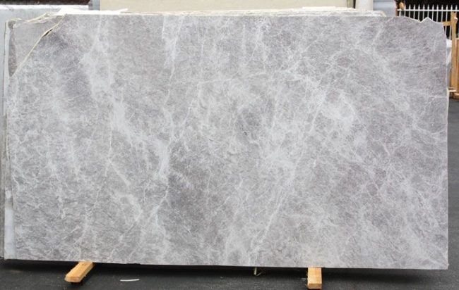


빠른 요약
Quartzite can be an outstanding material for feature wall projects in North America when buyers select it as an architectural surface rather than just a decorative slab. The strongest results usually come from balancing slab movement, background tone, panel scale, lighting response, and installation logic. A successful quartzite feature wall should feel visually powerful yet controlled, with enough natural character to anchor the room without making the composition feel restless or overdesigned.

Feature walls have become one of the most important visual tools in North American interior design. In residential spaces, they often define a living room, fireplace zone, dining backdrop, bedroom headboard wall, or entry statement surface. In hospitality and commercial environments, they help create brand identity, focal hierarchy, and spatial rhythm. Because these walls are usually among the most visible surfaces in the room, material choice matters more than many buyers expect.
Quartzite is increasingly relevant in this category because it offers a rare mix of natural depth, strong surface identity, and premium architectural presence. Unlike highly uniform engineered materials, quartzite can bring geological movement and layered mineral character that feel more authentic at full wall scale. At the same time, that natural richness means it must be selected carefully. A slab that looks dramatic in a yard may become too chaotic on a large wall, while a quieter slab may become far more elegant once installed as large-format vertical panels.
That is why a real quartzite design guide for feature wall projects in North America should not focus only on color preference or trend language. Buyers need to understand how quartzite behaves visually at scale, how panel breakdown affects the design, how the wall interacts with floors, cabinetry, lighting, and furniture, and how fabrication and installation influence the final result. The best wall is not simply made from a beautiful stone. It is made from a beautiful stone used in the right way.
Why Quartzite Works Well for Feature Walls
Quartzite works especially well for feature walls because it creates visual gravity without relying on ornament. In many premium interiors, the design goal is not to decorate every surface. It is to allow one or two major surfaces to carry the room. Quartzite can do that effectively because it has natural movement, tonal complexity, and depth that remain convincing both from a distance and at close range. A well-selected quartzite wall often feels more substantial and more timeless than a highly patterned man-made alternative.
Another advantage is versatility. Quartzite can support very different design directions depending on the slab selected. Some quartzites feel calm, pale, and architectural, working well in soft luxury interiors with oak, linen tones, and restrained metals. Others feel darker, richer, and more dramatic, which may suit hospitality-inspired spaces, fireplace compositions, or formal entertaining rooms. This range allows the material to work across a broad spectrum of North American projects.
Quartzite also performs strongly where the feature wall is meant to signal natural luxury rather than graphic decoration. Because the material is genuinely geological, it can create a more mature and grounded result than some strongly stylized engineered wall finishes. However, that same natural character means the buyer must think beyond isolated beauty. Pattern scale, joint location, panel orientation, and relationship to surrounding elements all matter significantly.
What North American Buyers Usually Need from a Feature Wall Material
Most buyers in this market want a feature wall that feels premium but not excessive. They usually want enough visual identity to justify the wall as a focal element, but not so much movement that the room becomes visually unstable. In living rooms, the wall may need to support furniture, lighting, and sometimes a television or fireplace opening. In hospitality spaces, it may need to create impact while still allowing the broader environment to function. In both cases, visual control is critical.
That creates a practical set of decision factors. One is background tone. Another is vein movement and pattern scale. Another is whether the quartzite will be used in large panels or smaller pieces. Another is finish. Another is how the wall terminates at edges, ceilings, cabinetry, and corners. Buyers also need to consider whether the selected quartzite supports the intended mood of the room: calm luxury, warm modern, dramatic focal point, or hospitality-inspired statement.
The strongest choices usually come from thinking at room scale rather than sample scale. A slab that feels modest in a close-up may become stunning when installed across a full-height feature wall. A slab that looks exciting in a small crop may become too busy when repeated over several vertical panels. The best results come from choosing quartzite that is architecturally legible rather than merely photogenic.

How to Evaluate Quartzite for Feature Wall Use
배경 색조
Background tone is often the first major filter. Pale whites, soft grays, creamy neutrals, warm taupes, and muted earth tones tend to work especially well in North American feature wall applications because they coordinate with common flooring, millwork, and upholstery palettes. Darker quartzites can also be highly successful, especially in fireplace walls and more dramatic hospitality-inspired spaces, but they should be reviewed carefully for room size and lighting level. A wall that is too dark for the space can feel heavy rather than refined.
Pattern Movement
Quartzite movement should be judged at full wall scale. Strong directional veining can create a memorable and premium result when panel layout is planned carefully. Broader flowing movement often works especially well because it gives the wall a natural architectural rhythm. By contrast, highly fragmented or overly busy quartzite may become visually tiring when spread across a large vertical plane. Buyers should think about whether the wall is meant to feel calm and cohesive or dramatic and expressive, then choose accordingly.
Panel Size and Joint Frequency
Feature walls usually look more premium when joints are reduced. Larger panels allow the quartzite to read as a surface rather than as a series of pieces. This is especially important in living rooms, hotel lobbies, reception areas, and fireplace walls where the wall needs to feel composed from a distance. The best quartzite for feature wall use is often the quartzite that can support clean panel logic rather than the slab with the most individually striking section.
Finish and Light Response
Finish affects how the quartzite interacts with the room. Polished surfaces can create a richer, brighter, and more formal effect, especially in luxury settings. Honed finishes often feel more contemporary and softer under ambient light. Leathered or textured finishes may add tactility, but they should be selected with care because vertical shadowing and maintenance expectations can change the reading of the wall. The finish should support the room’s atmosphere rather than simply follow material fashion.
Relationship to the Whole Room
A feature wall never succeeds alone. It must work with the floor, ceiling, millwork, furniture, lighting, and any architectural interruptions such as fireplaces, shelving, or television placements. A quartzite that is beautiful by itself may still be the wrong choice if it competes too strongly with adjacent materials. The best wall is the one that gives the room hierarchy, not noise.

Popular Quartzite Profiles for Feature Wall Projects
| Quartzite Profile | 가장 적합한 경우 | 장점 | Main Watchpoints |
|---|---|---|---|
| Soft White or Light Grey Quartzite | Living rooms, fireplace walls, calm luxury interiors | Brightens the room, broad design compatibility, premium but restrained | Can feel too quiet if the room lacks contrast |
| Warm Beige or Taupe Quartzite | Layered residential spaces, warm modern interiors | 편안한 톤, 목재 및 황동과의 강력한 조화 | 평범해 보이지 않도록 좋은 조명이 필요합니다 |
| 방향성 있는 결 구조의 석영석 | 고강도 포인트 벽, 인상적인 벽난로 구역 | 강렬한 시각적 정체성, 건축적 움직임 | 패널 레이아웃은 신중하게 제어해야 합니다 |
| 다크 석영석 | 환대 공간, 극적인 포인트 벽, 대형 실 | 깊이, 풍부함, 프리미엄 분위기 | 작거나 빛이 부족한 공간에서는 무겁게 느껴질 수 있습니다 |
| 흐린 또는 부드러운 움직임의 석영석 | 스파 같은 고급 인테리어와 미묘한 포인트 벽 | 자연스러운 차분함, 덜 시각적 긴장감, 우아한 전면 벽 읽기 | 전체 효과를 내려면 큰 패널링이 필요합니다 |
공간 유형별 최적 적용 사례
거실에서 석영석 포인트 벽은 보통 벽난로, 미디어 구성, 중앙 좌석 축을 지지할 때 가장 잘 작동합니다. 이러한 공간에서는 벽이 방을 안정적으로 잡아주는 동시에 가구와 조명이 함께 어울릴 수 있을 만큼 차분해야 합니다. 더 부드러운 화이트, 옅은 그레이, 따뜻한 중성 색상의 석영석은 공간을 압도하지 않으면서 세련된 느낌을 주기 때문에 특히 좋은 성능을 발휘합니다.
현관 공간에서는 구매자가 더 표현력 있는 석영석을 사용할 수 있습니다. 벽은 첫인상과 공간 정체성을 만들어내야 하기 때문입니다. 이곳에서는 주변 재료 팔레트가 통제된다면 더 강한 결이나 더 풍부한 광물 깊이가 매우 효과적일 수 있습니다. 침실에서는 더 차분한 석영석이 일반적으로 더 잘 작동합니다. 벽은 시각적 강렬함보다는 차분하고 부드러움을 지원해야 하기 때문입니다.
호스피탈리티 및 상업 인테리어에서 최적의 석영석 선택은 브랜드 분위기에 따라 달라집니다. 부티크 럭셔리 프로젝트는 더 풍부하고 극적인 석영석을 활용하는 것이 유리할 수 있지만, 대량 생산되는 프리미엄 환경에서는 더 차분하고 반복 가능한 슬래브 특성이 필요할 수 있습니다. 두 경우 모두 벽은 단순한 장식적 배경이 아니라 큰 표면 시스템으로 설계되어야 합니다.
구매자가 흔히 저지르는 실수
첫 번째 실수는 클로즈업 슬래브 사진만을 기준으로 선택하는 것입니다. 포인트 벽은 방 규모의 구성이며, 석영석은 완성된 설치 규모에서 검토되어야 합니다. 두 번째 실수는 조인트, 컷아웃, 가장자리 상태를 과소평가하는 것입니다. 아름다운 석영석이라도 패널 분해가 서툴거나 벽에 불완전한 전환이 포함되면 그 효과를 크게 잃을 수 있습니다.
또 다른 흔한 문제는 의도된 공간에 비해 너무 시각적으로 활발한 석영석을 선택하는 것입니다. 구매자는 종종 더 강한 움직임이 자동으로 더 강력한 디자인을 의미한다고 생각합니다. 실제로 많은 프리미엄 인테리어는 벽이 일정한 드라마가 아닌 통제된 자연스러운 특성을 지닐 때 더욱 설득력 있게 됩니다. 마지막 실수는 조명을 무시하는 것입니다. 석영석은 낮빛, 주변 저녁 조명, 스포트라이트, 벽 세척 등에 따라 크게 달라질 수 있습니다. 좋은 검토는 이러한 모든 요소를 고려해야 합니다.
구매자가 승인 전 검토해야 할 사항
포인트 벽용 석영석을 승인하기 전에 구매자는 전체 슬래브나 의도된 패널 레이아웃의 대규모 시뮬레이션을 검토해야 합니다. 지배적인 배경 톤, 결의 방향과 밀도, 예상되는 조인트 위치, 그리고 벽이 모서리, 천장, 캐비닛 또는 개구부에서 어떻게 마무리될지 확인해야 합니다. 벽에 벽난로, TV 홈, 선반, 떠있는 마감재가 포함된다면 이 모든 요소도 재료 결정의 일부로 다뤄져야 합니다.
프로젝트의 바닥재, 실내 장식 팔레트, 나무 톤, 금속 마감과 석영석을 비교하는 것도 현명합니다. 단독으로는 이상적으로 보이는 슬래브라도 전체 디자인 구성에 배치하면 어긋나는 느낌을 줄 수 있습니다. 이를 초기에 검토할수록 최종 결과가 더 좋습니다.
공급업체 지원이 기능벽 결정을 어떻게 개선하는지
중국에서 소싱하는 구매자라면 공급업체의 지원이 중요합니다. 포인트 벽용 석영석 선택은 매력적인 돌을 고르는 것만이 아니기 때문입니다. 슬래브 특성이 대형 수직 패널링에 적합한지, 레이아웃을 통해 움직임을 제어할 수 있는지, 제작과 설치를 고려했을 때 디자인의 시각적 야망이 현실적으로 유지되는지 등을 확인하는 것도 중요합니다. 지식이 풍부한 공급업체는 생산 시작 전 이러한 불확실성을 줄여줍니다.
실질적으로 이는 여러 석영석 옵션을 비교하고, 어떤 슬래브가 차분한 건축 벽과 강한 포인트 벽에 더 적합한지 파악하며, 사진에는 잘 보이지만 포인트 벽 시스템에 나누었을 때 너무 파편화되는 선택을 피하도록 돕는 것을 포함할 수 있습니다. 프리미엄 주거, 환대, 상업 작업에서는 이 과정이 프로젝트의 최종 품질에 큰 영향을 미칠 수 있습니다.

자주 묻는 질문
1. 석영석은 포인트 벽에 좋은 재료인가요?
Yes. Quartzite can be an excellent material for feature walls because it offers natural depth, premium visual character, and strong architectural presence. The key is selecting a slab with the right tone, movement, and layout potential.
2. 북미에서 포인트 벽에 가장 잘 맞는 석영석 색상은 무엇인가요?
부드러운 화이트, 라이트 그레이, 따뜻한 베이지, 그리고 토프 석영석은 종종 가장 다용도로 활용될 수 있습니다. 이는 일반적인 북미 인테리어 팔레트와 잘 어울리면서도 고급스러운 중심 요소를 만들어내기 때문입니다.
3. 석영석 포인트 벽은 폴리싱해야 할까요, 아니면 호닝해야 할까요?
Both can work. Polished quartzite often feels richer and more formal, while honed quartzite usually feels calmer and more contemporary. The best choice depends on the project’s design direction and lighting conditions.
4. 어두운 석영석이 항상 더 강력한 포인트 벽을 만드나요?
No. Darker quartzite can be dramatic and luxurious, but it can also feel heavy in smaller or dimmer spaces. Strong feature walls come from proportion and control, not only darkness.
5. 포인트 벽에서 중요한 것은 슬래브의 아름다움인가, 아니면 패널 레이아웃인가요?
Both matter, but panel layout is often underestimated. Even an exceptional quartzite can lose much of its effect if the joint planning, direction, or integration with openings is poorly handled.
6. 석영석은 상업 및 환대 포인트 벽에도 사용될 수 있나요?
Yes. Quartzite can work very well in hospitality and commercial spaces when the slab character, scale, and layout are selected to support the design identity and practical installation logic of the project.
재료 선택 체크리스트:
북미에서 가장 좋은 석영석 포인트 벽은 자연석의 특성과 건축적 제어를 균형 있게 조화시킨 것입니다. 방 규모에서 석영석을 검토하고 패널 레이아웃을 신중히 고민하며 전체 인테리어 팔레트와 조화를 이루는 구매자는 보통 더 우아하고 설득력 있는 결과를 얻습니다.