


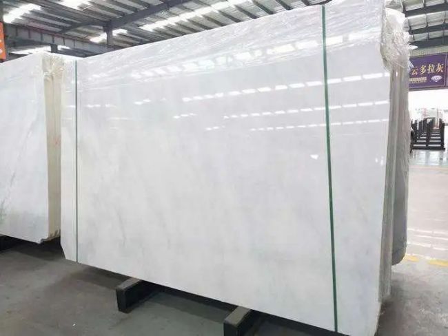
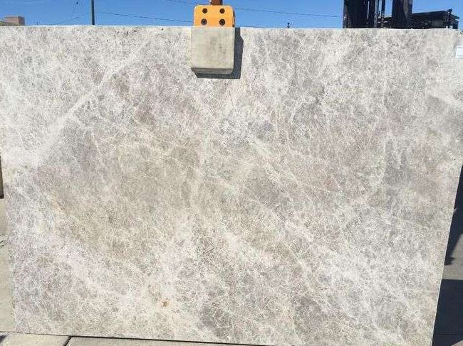
Riepilogo rapido
Quartzite can be an outstanding material for feature wall projects in North America when buyers select it as an architectural surface rather than just a decorative slab. The strongest results usually come from balancing slab movement, background tone, panel scale, lighting response, and installation logic. A successful quartzite feature wall should feel visually powerful yet controlled, with enough natural character to anchor the room without making the composition feel restless or overdesigned.

Feature walls have become one of the most important visual tools in North American interior design. In residential spaces, they often define a living room, fireplace zone, dining backdrop, bedroom headboard wall, or entry statement surface. In hospitality and commercial environments, they help create brand identity, focal hierarchy, and spatial rhythm. Because these walls are usually among the most visible surfaces in the room, material choice matters more than many buyers expect.
Quartzite is increasingly relevant in this category because it offers a rare mix of natural depth, strong surface identity, and premium architectural presence. Unlike highly uniform engineered materials, quartzite can bring geological movement and layered mineral character that feel more authentic at full wall scale. At the same time, that natural richness means it must be selected carefully. A slab that looks dramatic in a yard may become too chaotic on a large wall, while a quieter slab may become far more elegant once installed as large-format vertical panels.
That is why a real quartzite design guide for feature wall projects in North America should not focus only on color preference or trend language. Buyers need to understand how quartzite behaves visually at scale, how panel breakdown affects the design, how the wall interacts with floors, cabinetry, lighting, and furniture, and how fabrication and installation influence the final result. The best wall is not simply made from a beautiful stone. It is made from a beautiful stone used in the right way.
Why Quartzite Works Well for Feature Walls
Quartzite works especially well for feature walls because it creates visual gravity without relying on ornament. In many premium interiors, the design goal is not to decorate every surface. It is to allow one or two major surfaces to carry the room. Quartzite can do that effectively because it has natural movement, tonal complexity, and depth that remain convincing both from a distance and at close range. A well-selected quartzite wall often feels more substantial and more timeless than a highly patterned man-made alternative.
Another advantage is versatility. Quartzite can support very different design directions depending on the slab selected. Some quartzites feel calm, pale, and architectural, working well in soft luxury interiors with oak, linen tones, and restrained metals. Others feel darker, richer, and more dramatic, which may suit hospitality-inspired spaces, fireplace compositions, or formal entertaining rooms. This range allows the material to work across a broad spectrum of North American projects.
Quartzite also performs strongly where the feature wall is meant to signal natural luxury rather than graphic decoration. Because the material is genuinely geological, it can create a more mature and grounded result than some strongly stylized engineered wall finishes. However, that same natural character means the buyer must think beyond isolated beauty. Pattern scale, joint location, panel orientation, and relationship to surrounding elements all matter significantly.
Cosa gli acquirenti nordamericani cercano solitamente in un materiale per pareti decorative
Most buyers in this market want a feature wall that feels premium but not excessive. They usually want enough visual identity to justify the wall as a focal element, but not so much movement that the room becomes visually unstable. In living rooms, the wall may need to support furniture, lighting, and sometimes a television or fireplace opening. In hospitality spaces, it may need to create impact while still allowing the broader environment to function. In both cases, visual control is critical.
That creates a practical set of decision factors. One is background tone. Another is vein movement and pattern scale. Another is whether the quartzite will be used in large panels or smaller pieces. Another is finish. Another is how the wall terminates at edges, ceilings, cabinetry, and corners. Buyers also need to consider whether the selected quartzite supports the intended mood of the room: calm luxury, warm modern, dramatic focal point, or hospitality-inspired statement.
The strongest choices usually come from thinking at room scale rather than sample scale. A slab that feels modest in a close-up may become stunning when installed across a full-height feature wall. A slab that looks exciting in a small crop may become too busy when repeated over several vertical panels. The best results come from choosing quartzite that is architecturally legible rather than merely photogenic.

How to Evaluate Quartzite for Feature Wall Use
Tonalità di fondo
Background tone is often the first major filter. Pale whites, soft grays, creamy neutrals, warm taupes, and muted earth tones tend to work especially well in North American feature wall applications because they coordinate with common flooring, millwork, and upholstery palettes. Darker quartzites can also be highly successful, especially in fireplace walls and more dramatic hospitality-inspired spaces, but they should be reviewed carefully for room size and lighting level. A wall that is too dark for the space can feel heavy rather than refined.
Pattern Movement
Quartzite movement should be judged at full wall scale. Strong directional veining can create a memorable and premium result when panel layout is planned carefully. Broader flowing movement often works especially well because it gives the wall a natural architectural rhythm. By contrast, highly fragmented or overly busy quartzite may become visually tiring when spread across a large vertical plane. Buyers should think about whether the wall is meant to feel calm and cohesive or dramatic and expressive, then choose accordingly.
Panel Size and Joint Frequency
Feature walls usually look more premium when joints are reduced. Larger panels allow the quartzite to read as a surface rather than as a series of pieces. This is especially important in living rooms, hotel lobbies, reception areas, and fireplace walls where the wall needs to feel composed from a distance. The best quartzite for feature wall use is often the quartzite that can support clean panel logic rather than the slab with the most individually striking section.
Finish and Light Response
Finish affects how the quartzite interacts with the room. Polished surfaces can create a richer, brighter, and more formal effect, especially in luxury settings. Honed finishes often feel more contemporary and softer under ambient light. Leathered or textured finishes may add tactility, but they should be selected with care because vertical shadowing and maintenance expectations can change the reading of the wall. The finish should support the room’s atmosphere rather than simply follow material fashion.
Relationship to the Whole Room
A feature wall never succeeds alone. It must work with the floor, ceiling, millwork, furniture, lighting, and any architectural interruptions such as fireplaces, shelving, or television placements. A quartzite that is beautiful by itself may still be the wrong choice if it competes too strongly with adjacent materials. The best wall is the one that gives the room hierarchy, not noise.

Popular Quartzite Profiles for Feature Wall Projects
| Quartzite Profile | Migliore per | Vantaggi | Main Watchpoints |
|---|---|---|---|
| Soft White or Light Grey Quartzite | Living rooms, fireplace walls, calm luxury interiors | Brightens the room, broad design compatibility, premium but restrained | Può risultare troppo tranquillo se la stanza manca di contrasti |
| Warm Beige or Taupe Quartzite | Layered residential spaces, warm modern interiors | Tono confortevole, forte coordinamento con legno e ottone | Necessita di una buona illuminazione per evitare un aspetto piatto |
| Quarzite a venature direzionali | Pareti caratterizzanti ad alto impatto, zone camino di grande effetto | Identità visiva forte, movimento architettonico | La disposizione dei pannelli deve essere controllata con cura |
| Quarzite scura | Spazi ricettivi, pareti focali drammatiche, stanze ampie | Profondità, ricchezza, atmosfera premium | Può risultare pesante in spazi più piccoli o con scarsa illuminazione |
| Quarzite nuvolosa o a movimento morbido | Interni di lusso stile spa e pareti sottili dal forte impatto | Calma naturale, minore tensione visiva, elegante lettura su tutta la parete | Necessita di grandi pannelli per raggiungere l'effetto completo |
Migliori applicazioni per tipo di spazio
Nei salotti, le pareti caratterizzanti in quarzite funzionano spesso meglio se sostengono un camino, una composizione multimediale o un asse centrale di sedute. In questi ambienti, la parete dovrebbe essere abbastanza forte da ancorare la stanza ma sufficientemente calma da permettere ai mobili e all'illuminazione di coesistere con essa. Quarziti bianchi più tenui, grigi chiari e neutri caldi spesso danno risultati particolarmente buoni perché rendono lo spazio sofisticato senza sovraccaricarlo.
Negli spazi d'ingresso, gli acquirenti possono spesso utilizzare quarziti più espressivi perché la parete è destinata a creare la prima impressione e l'identità dello spazio. Qui, venature più forti o profondità minerale più ricca possono essere estremamente efficaci se la palette materica circostante è ben disciplinata. Nelle camere da letto, i quarziti più tranquilli di solito funzionano meglio perché la parete dovrebbe sostenere calma e dolcezza piuttosto che intensità visiva.
Negli interni ricettivi e commerciali, la scelta migliore di quarzite dipende dall'atmosfera del brand. Un progetto di lusso boutique può trarre beneficio da quarziti più ricchi e drammatici, mentre un ambiente premium di maggior volume potrebbe aver bisogno di un carattere della lastra più calmo e ripetibile. In entrambi i casi, la parete dovrebbe comunque essere progettata come un sistema di superficie ampia, non semplicemente come uno sfondo decorativo.
Errori comuni degli acquirenti
Il primo errore è selezionare esclusivamente sulla base delle fotografie ravvicinate delle lastre. Le pareti caratterizzanti sono composizioni a scala della stanza, e la quarzite deve essere valutata alla scala dell'installazione finita. Il secondo errore è sottovalutare giunti, ritagli e condizioni dei bordi. Persino una bella quarzite può perdere gran parte del suo effetto se la suddivisione dei pannelli è goffa o se la parete include transizioni mal risolte.
Un altro problema comune è scegliere una quarzite troppo attiva dal punto di vista visivo per lo spazio previsto. A volte gli acquirenti assumono che un movimento più intenso significhi automaticamente un design più forte. In realtà, molti interni premium diventano più convincenti quando la parete porta un carattere naturale controllato invece che un dramma costante. Un ultimo errore è trascurare l'illuminazione. La quarzite può cambiare notevolmente sotto la luce del giorno, la luce ambientale serale, i faretti e il lavaggio delle pareti. Una buona valutazione tiene conto di tutto questo.
What Buyers Should Review Before Approval
Prima di approvare la quarzite per una parete caratterizzante, gli acquirenti dovrebbero esaminare la lastra intera o una simulazione visiva di grande dimensione della disposizione dei pannelli prevista. Dovrebbero confermare il tono dominante dello sfondo, la direzione e la densità delle venature, la posizione probabile dei giunti e come la parete terminerà agli angoli, sui soffitti, negli arredi o nelle aperture. Se la parete include un camino, un vano TV, scaffali o elementi mobili sospesi, tutti questi devono essere considerati parte della decisione materica.
È anche consigliabile confrontare la quarzite con il pavimento del progetto, la palette di tappezzeria, i toni del legno e le finiture metalliche. Una lastra che sembra ideale isolata potrebbe risultare disallineata una volta inserita nella composizione completa del progetto. Più presto si esamina questo aspetto, migliore tende a essere il risultato finale.
Come il supporto del fornitore migliora le decisioni sulla parete decorativa
Per gli acquirenti che si riforniscono dalla Cina, il supporto del fornitore è importante perché la scelta della quarzite per pareti caratterizzanti non riguarda solo la selezione di una pietra attraente. Implica anche verificare se il carattere della lastra si adatta a grandi pannelli verticali, se il movimento può essere controllato tramite la disposizione e se l'ambizione visiva del progetto rimane realistica una volta considerate fabbricazione e installazione. Un fornitore competente aiuta a ridurre queste incertezze prima dell'inizio della produzione.
In termini pratici, questo può includere il confronto tra diverse opzioni di quarzite, identificando quali lastre si adattano meglio a pareti architettoniche calme rispetto a pareti forti e focali, e aiutando gli acquirenti a evitare selezioni che fotografano bene ma diventano troppo frammentate quando divise su un sistema di pareti caratterizzanti. Per lavori residenziali, ricettivi e commerciali di alta gamma, questo processo può avere un impatto significativo sulla qualità finale del progetto.

FAQ
1. La quarzite è un buon materiale per pareti caratterizzanti?
Yes. Quartzite can be an excellent material for feature walls because it offers natural depth, premium visual character, and strong architectural presence. The key is selecting a slab with the right tone, movement, and layout potential.
2. Quale colore di quarzite funziona meglio per pareti caratterizzanti in Nord America?
I quarziti morbidi bianchi, grigio chiaro, beige caldo e tortora sono spesso i più versatili perché si integrano bene con le palette interne comuni in Nord America, creando al contempo una superficie centrale di alto pregio.
3. Le pareti caratterizzanti in quarzite dovrebbero essere lucide o levigate?
Both can work. Polished quartzite often feels richer and more formal, while honed quartzite usually feels calmer and more contemporary. The best choice depends on the project’s design direction and lighting conditions.
4. Una quarzite più scura crea sempre una parete caratterizzante più forte?
No. Darker quartzite can be dramatic and luxurious, but it can also feel heavy in smaller or dimmer spaces. Strong feature walls come from proportion and control, not only darkness.
5. Cosa conta di più per una parete caratterizzante: la bellezza della lastra o la disposizione dei pannelli?
Both matter, but panel layout is often underestimated. Even an exceptional quartzite can lose much of its effect if the joint planning, direction, or integration with openings is poorly handled.
6. La quarzite può essere usata in pareti caratterizzanti commerciali e ricettive?
Yes. Quartzite can work very well in hospitality and commercial spaces when the slab character, scale, and layout are selected to support the design identity and practical installation logic of the project.
Nota finale / Conseguenze pratiche
La migliore parete caratterizzante in quarzite in Nord America è quella che bilancia il carattere della pietra naturale con il controllo architettonico. Gli acquirenti che esaminano la quarzite alla scala della stanza, riflettono attentamente sulla disposizione dei pannelli e coordinano la parete con l'intera palette interna di solito ottengono risultati più eleganti e convincenti.